

In today’s digital enterprise, data is everywhere—but making sense of it is the real challenge. Simply having data isn’t enough. To unlock value, you need effective dashboard design that brings clarity, focus, and direction to decision-making.
For product managers, analytics leads, and business intelligence teams, a well-designed dashboard is more than a reporting tool. It’s a strategic enabler. This dashboard design guide provides a practical framework to help you move beyond the clutter and build dashboards that drive real business outcomes.
Why Dashboard Design Matters More Than Ever
Modern businesses rely on real-time visibility into KPIs, customer behavior, and operational efficiency. Yet, many dashboards fail—not because of a lack of data—but because of poor design.
A generic dashboard might look fine, but without alignment to your business goals, it becomes just another screen. That’s why effective dashboard design is now a core competency for fast-growing teams.
Custom-built dashboards give organizations a competitive edge by offering:
- Role-based insights tailored to departments and users
- Real-time tracking of critical performance metrics
- Enhanced team collaboration through shared data views
- Informed, faster decisions driven by intuitive visualization
Types of Dashboards: What Your Team Really Needs
A central principle in this dashboard design guide is choosing the right dashboard for the right audience. Not all dashboards are created equal.
Operational Dashboards
Built for delivery, support, and ops teams, these dashboards track live performance metrics and flag real-time issues. Think of them as early-warning systems.
Analytical Dashboards
Used by data scientists and analysts, these dashboards enable deep dives into historical trends, behaviors, and KPIs to support experimentation and discovery.
Strategic Dashboards
Designed for executive leadership, strategic dashboards provide high-level visibility into long-term goals, revenue progress, and cross-functional KPIs.
Each type requires its own dashboard design strategy—and knowing which one to use is half the battle.
Best Practices for Dashboard Design
Creating a dashboard is easy. Creating a useful one? That takes skill. The following best practices for dashboard design ensure your dashboards deliver actual value, not just charts.
1. Start with the Decision, Not the Data
Before you add any visual elements, define the decisions the dashboard is meant to support. Ask:
- What business question are we answering?
- Who is the end user, and what actions will they take based on this dashboard?
2. Focus on Business-Relevant KPIs
Avoid the “more is better” trap. Select metrics that matter—those that influence customer behavior, drive revenue, or reflect team performance.
3. Design for Interactivity and Exploration
Add filters, drill-downs, or tooltips that allow users to explore data without getting lost. A static dashboard can quickly become outdated.
4. Use Clear Visual Hierarchy
Guide users’ eyes through the content. Use bold colors for key KPIs, group related charts, and put summaries at the top, details below.
5. Test with Real Users Early
Even the most beautiful dashboard is useless if users don’t understand it. Share mockups or live previews with real users for feedback and iteration.
By applying these dashboard design best practices, teams can build dashboards that are not only informative—but truly impactful.
Mobile-Friendly & Scalable: A Must for Effective Dashboard Design
Today’s teams work across platforms—laptops, tablets, phones. That means responsive design isn’t a luxury—it’s a requirement.
An effective dashboard design should be:
- Fully responsive across devices
- Fast-loading, even with complex datasets
- Integrated securely with ERP, CRM, or cloud APIs
- Able to grow with your data and your team
At Kansoft, we ensure every dashboard we build is optimized for performance, usability, and scalability—regardless of your tech stack.
Your Dashboard Design Guide: Step-by-Step 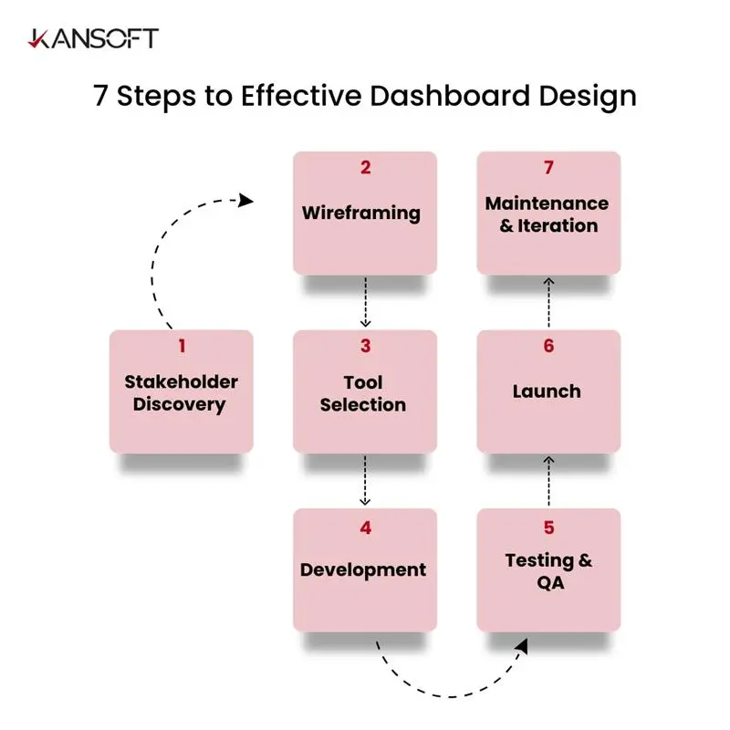
Let’s break down the process that forms the backbone of this dashboard design guide:
1. Stakeholder Discovery
Identify key users, their goals, and pain points.
2. Wireframing
Draft low-fidelity mockups to define layout, flow, and content.
3. Tool Selection
Choose between BI tools (Power BI, Tableau) or custom frameworks based on scale and needs.
4. Development
Connect data sources, build visual components, and apply logic.
5. Testing & QA
Run user testing loops to refine UX and functionality.
6. Launch
Deploy with access control and stakeholder training.
7. Maintenance & Iteration
Track usage and evolve the dashboard based on feedback and business changes.
Following this structured approach ensures that your dashboards are aligned with business goals and adaptable over time.
How Kansoft Helps Data & Product Teams Succeed
At Kansoft, we partner with Global tech teams to build custom dashboards that go beyond aesthetics. Our solutions are rooted in the best practices for dashboard design and built for real-world usage.
Our capabilities include:
- Intuitive UI/UX tailored to your user roles
- Seamless integration with cloud and on-prem systems
- High-performance, responsive design
- Custom dashboards for operational, analytical, and strategic use cases
- Agile delivery with KPI-driven outcomes
We understand: teams don’t need more dashboards—they need better ones.